Creating Reports using Jira, Timesheet Export & Google Sheets
Introduction
Jira is a fantastic tool for teams who want to get work done. What about understanding how your team spends their time, though? Does your team spend more time fixing bugs, or working on stories? Which epics have been worked on the most? Have particular issues taken a up a lot more of the team’s time than others?
It turns out that Timesheet Export and Google Sheets can be paired to provide some great insights on these topics as well as a lot more.
Getting data from Jira into Google Sheets
Before we get to the interesting part, let’s make sure all the prerequisites are ticked off:
1. Install TImesheet Export from the Atlassian Marketplace, if you haven’t already.
2. Get Google Drive, if you haven’t already got it.
3. Go into your project in Jira and export time using Timesheet Export. Refer to our guide on using Timesheet Export, if needed.
4. Load the exported file into Google Sheets. Click the + New button in Google Drive, and then select File upload. Pick the CSV file exported using Timesheet Export.
5. Double click on the uploaded file to open it.
Once you complete the steps above, you’re ready to go!
Build a simple pivot table & generate a chart
To begin with, let’s try to build a simple pivot table and plot a chart with data exported using Timesheet Export.
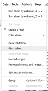
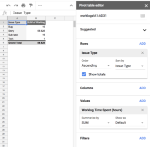
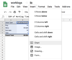
1. In Google Sheets, click the Data menu and then select Pivot table…
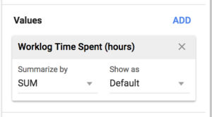
2. Under Values, select Worklog Time Spent (hours).
3. Under Rows, select any item you want to see the time logs grouped by. Suggestions: Issue Type, Author, Epic Name, or Issue Key.
4. Under Columns, optionally select a second grouping of the logged time. Example: You could pick Author as rows, and Worklog Created Date as columns in order to see a breakdown of time logged by each person by day.
5. Under Filters, optionally add any constraints you want to apply. Example: Worklog Created Date after 31 Dec 2017 to see only time logged during or after 2018.
6. Select the data and headings in the pivot table by dragging the mouse over them, and from the Insert menu, choose Chart. Be careful to leave out the Grand Total parts of the pivot table, or the data in your chart won’t be right.
7. Change the Chart Type based on how you would like the data to be represented.
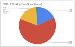
Below is an example chart created by choosing Issue Type for Rows, and Pie chart as the Chart type. This shows how much time has been logged against each type of issue.
More combinations to try
There are so many more useful insights you can gain from having access to the data exported by Timesheet Export in a spreadsheet. Below are some more combinations to try.
How much time has been spent on each Epic
- Rows: Epic Name
- Values: SUM of Worklog Time Spent (hours)
Hours logged per person, per day
- Rows: Author
- Columns: Worklog Started Date
- Values: SUM of Worklog Time Spent (hours)